Why We Changed the Site's Color Palette — Making Reading a More Pleasant Experience
If you’ve visited avelino.run recently, you may have noticed: the visual vibe is softer, calmer — and that’s completely intentional.
We redesigned the site’s color palette with one goal in mind: to make your reading experience more comfortable. And yes, there’s science behind it.
🧠 The Psychology of Color and Visual Fatigue
Studies in interface design and cognitive neuroscience show that pure white backgrounds and high-contrast elements can cause eye strain during extended reading sessions. A study published in the International Journal of Human-Computer Studies points out that soft, lightly tinted backgrounds can reduce visual stress and help readers stay focused for longer.
So we replaced the pure white background with #FAF9F6, a soft lavender tone that keeps the clarity of white while being easier on the eyes.
🎨 The New Color Palette
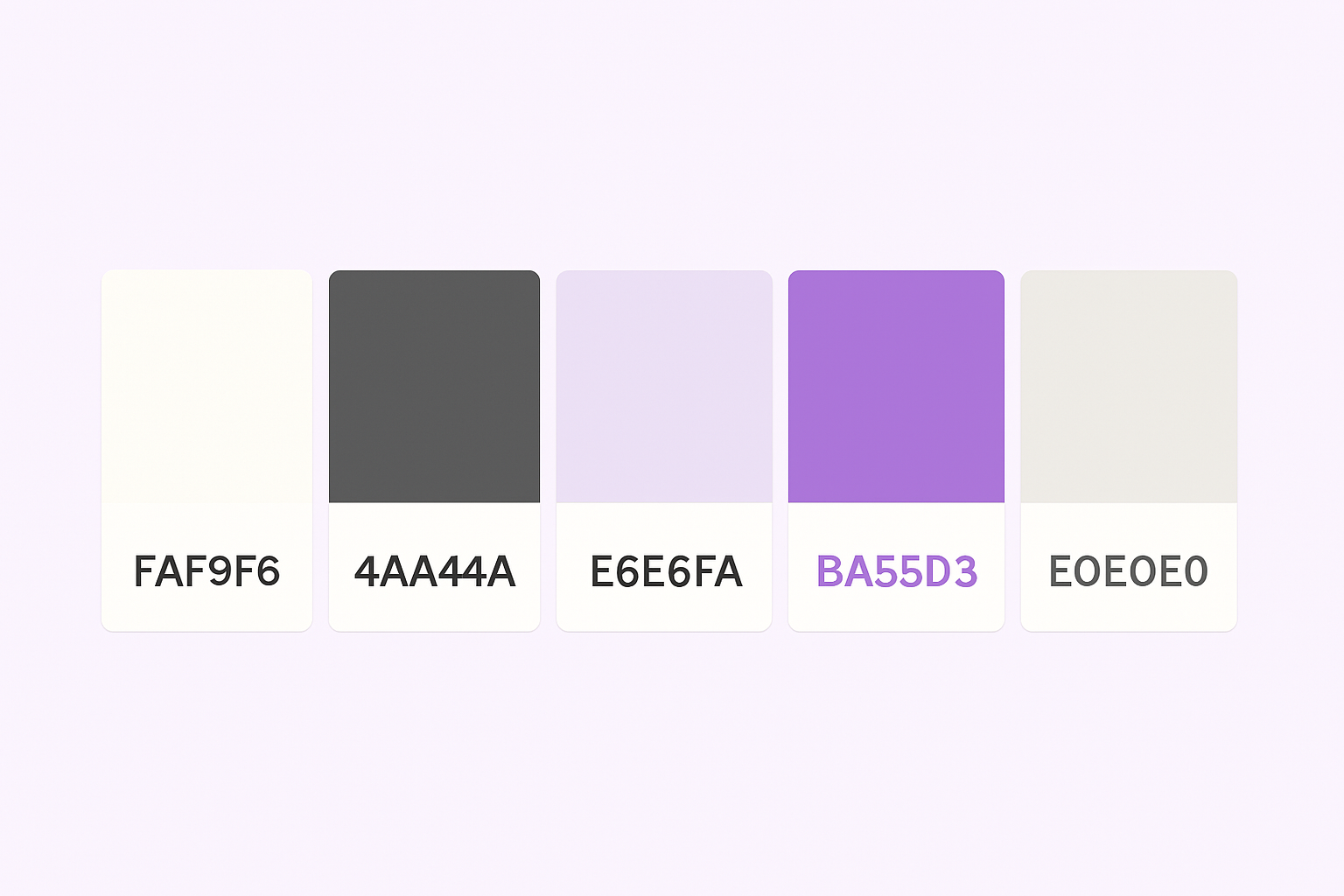
Our focus was to create a harmonious, accessible experience with a modern and welcoming vibe. Here's the palette:
- Background:
#FAF9F6– soft lavender that diffuses light and reduces glare. - Main Text:
#4A4A4A– dark gray for clean, high-contrast readability without harshness. - Links and Highlights:
#E6E6FA– a soft lavender accent that complements the background. - Buttons/CTAs:
#BA55D3– a vibrant purple for elements that need to stand out. - Borders/Dividers:
#E0E0E0– light gray to organize content gently and subtly.
💡 Our Goal Is Simple
We want reading on this site to feel as effortless as a good conversation. No fatigue. No distraction. Just clarity, flow, and focus.
Reference: Bauerly, M., & Liu, Y. (2006). Computational modeling and experimental investigation of effects of compositional elements on interface and design aesthetics. International Journal of Human-Computer Studies, 64(8), 670–682.